Web & Print Asthma Guide
CASE STUDY

CASE STUDY
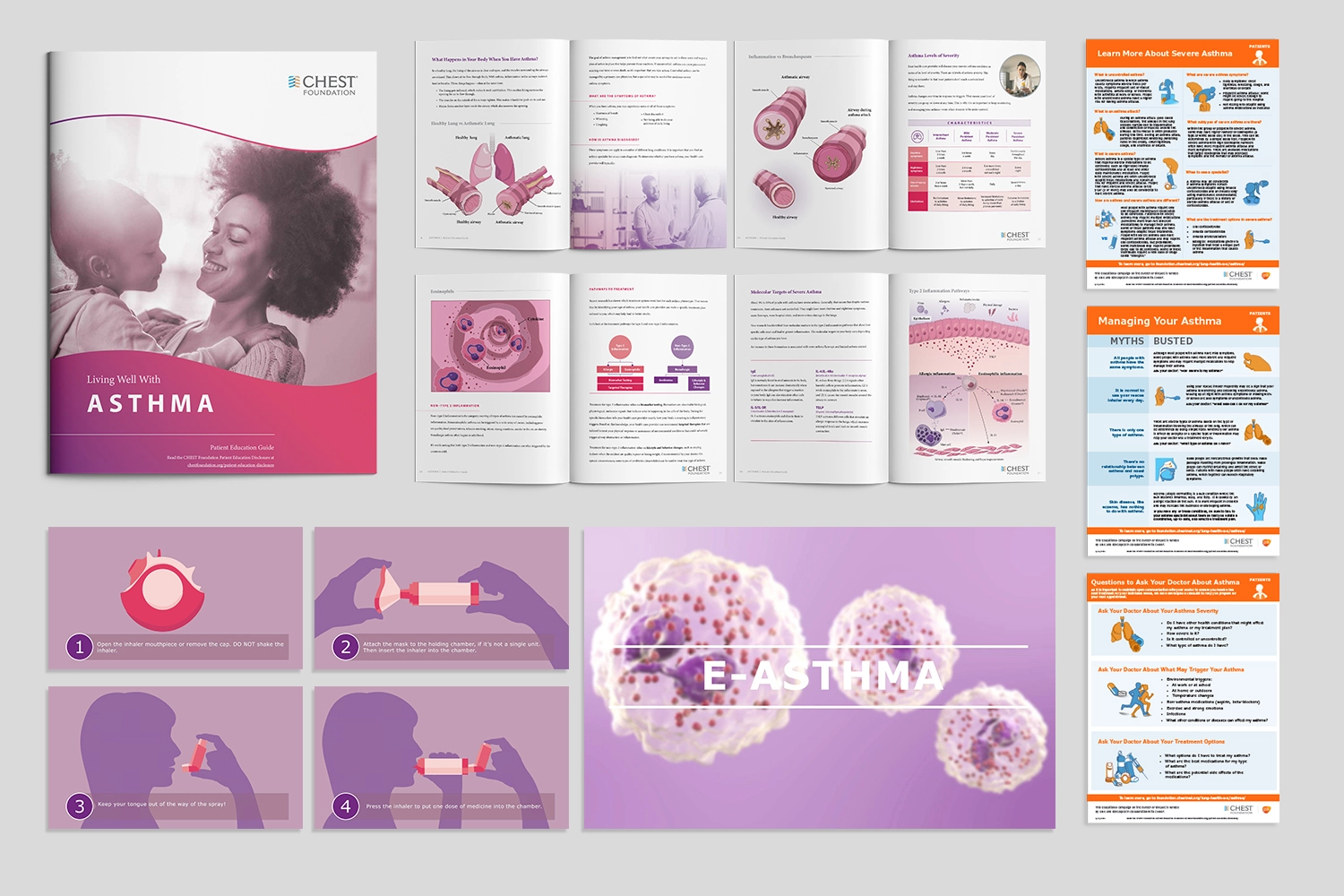
While severity of asthma varies from minor to life-threatening, it is manageable by lifestyle improvements and habit changes. Because severe asthma is more likely to be suffered by patients with lower education level, consistent patient education targeting this population makes the biggest social impact such as reducing hospital visits, increasing workers in the workforce, and better working condition for healthcare workers. While online and printed materials are accessible by patients and physicians, conventional resources remains as text and bullet-point heavy format unfriendly to the unfamiliar eyes. Sponsored by AstraZeneca, Sanofi, GlaxoSmithKline and Regeneron, our team collaborated with CHEST Foundation to challenge this issue. By creating an online e-learning library, we transformed existing information into a memorable experience. Our team, alongside healthcare professionals, ensured medical accuracy, credibility, and communication design of the content.
How can we create an informational hub that achieves both covers accessibility and credibility, where we can reach as many patients with various lifestyles and literacy, while ensuring the content’s credibility to the level that practicing physicians feel confident to refer their asthma patients to?
A webpage and printable guide packed with information on life improvement that directly speak to those with the most severe asthma symptoms. The package includes colorful illustration, animation, interactive elements, checklist as well as animated GIF, and covers information such as proper use of inhalers, an extensive list of common causes and solutions to asthma, and different types of asthma. This has launched CHEST to a new level of success.
Mao’s team is very quick on execution and extremely easy to work with! They are open to feedback and flexible on project needs and expectations during a rapid development of the project. Mao’s team provides a great visual solutions to the deliverables, no matter what format they are working on.

Madeline LeeCHEST American College of Chest Physicians
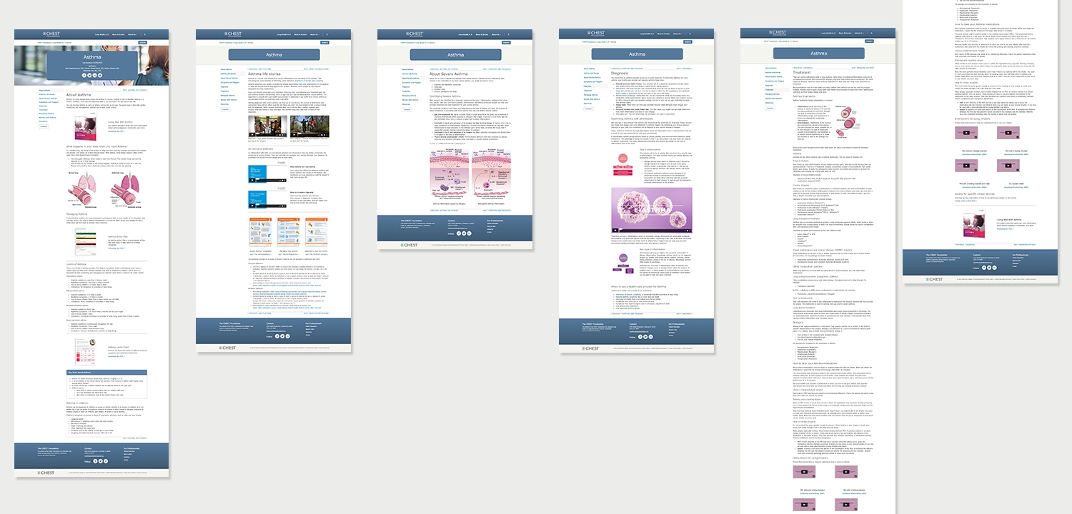
We analyzed the existing educational resources online and surfaced the problem CHEST foundation as an educational non-profit is challenged to solve. The strength of CHEST’s content lies in its thoroughness in everything that they published. Unlike many competitors -even ones that ranked higher in Google- weren’t able to achieve the depth CHEST provided. It is decided to double down on this approach while implementing a fresh look and new technology to enhance the audience’s learning experience.

By going deep into how CHEST is perceived as a leader in pulmonary health, our two user profiles were identified as pulmonary physicians and patients. Once we got past how seemingly different values they hold, we were able to surface how they share a common goal of overcoming asthma; Asthma is a condition that affects the patients’ way of living. Understanding the cause and implementing the new, proper habits are key to their wellbeing.
“How do we appeal to those who are forced to have their lifestyle change?” became the anchor to every direction we take.
Following the strategy and user identity session, the priority is set to implementing a fine balance between accessibility and credibility. Our goals were two-folds:
Visuals, as well as the interactivity was decided to be implemented throughout the content.
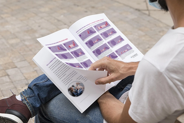

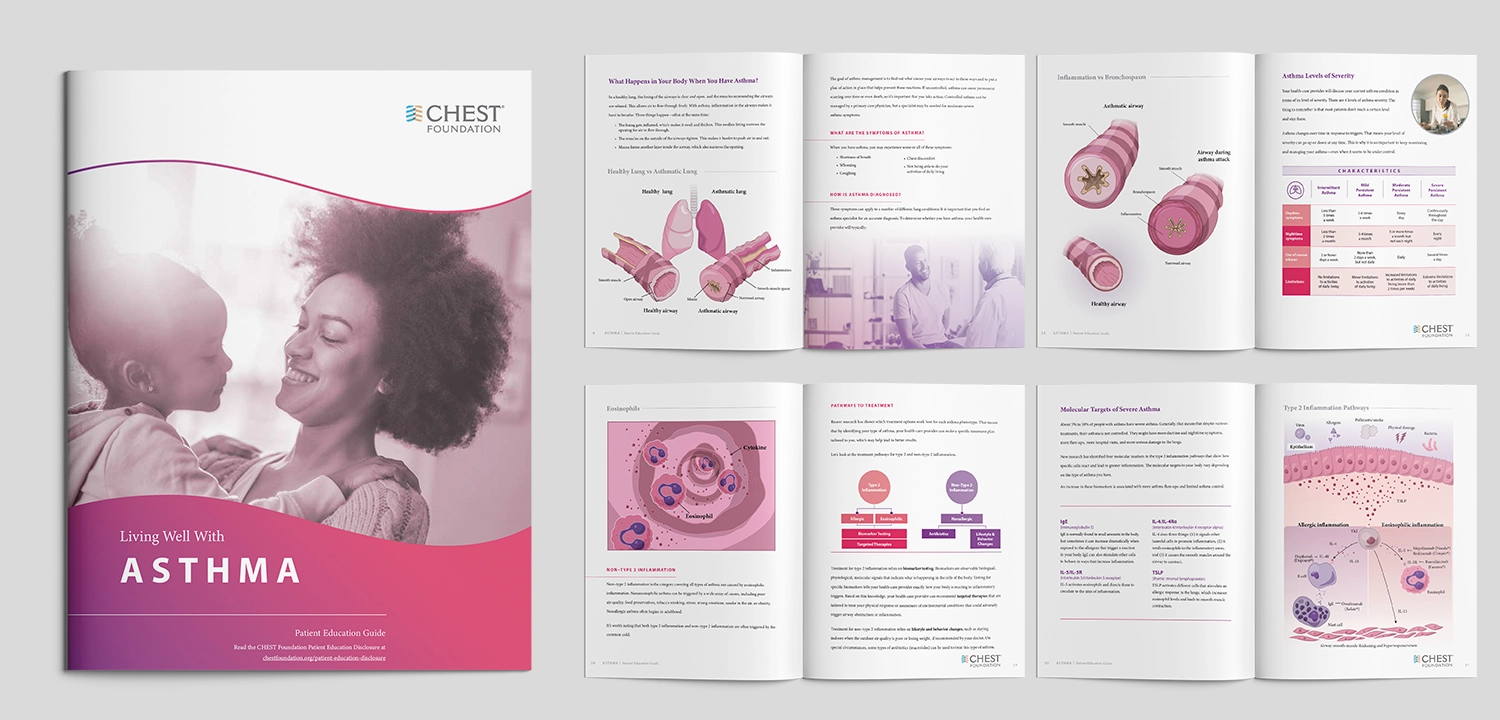
To offer a physical guidebook that the physicians and nurses can hand out to patients on their visits, we first developed a printable guidebook “Living well with Asthma.” For patients who don't know CHEST’s content, this served as an entry way to learning about our website. From common triggers + solutions to proper guidance on using various inhalers, the content is jam packed with information designed to guide patients in the betterment of their lives, as well as stories to ensure patients that they’re not alone in this journey.
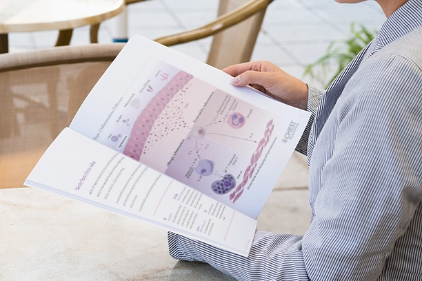
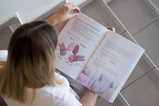
To facilitate open communications between asthma patients and doctors during their appointments, we created quick and digestible sets of instructions that cover commonly misunderstood information about severe asthma. The set consists of infographic, mythbuster, and checklists to raise awareness about different types and causes of asthma.


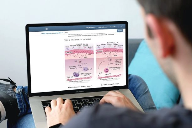
In CHEST's web experience, we were able to completely reframe the storytelling and user journey to learn about asthma online by reorganizing the content and implementing an interactive approach to the design. Approaches such as animated gifs and webinars were essential to the process.
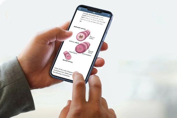
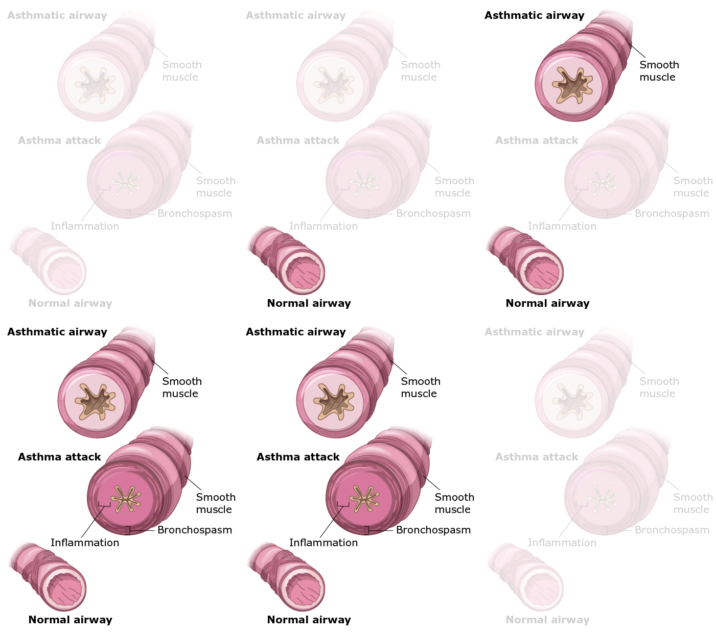
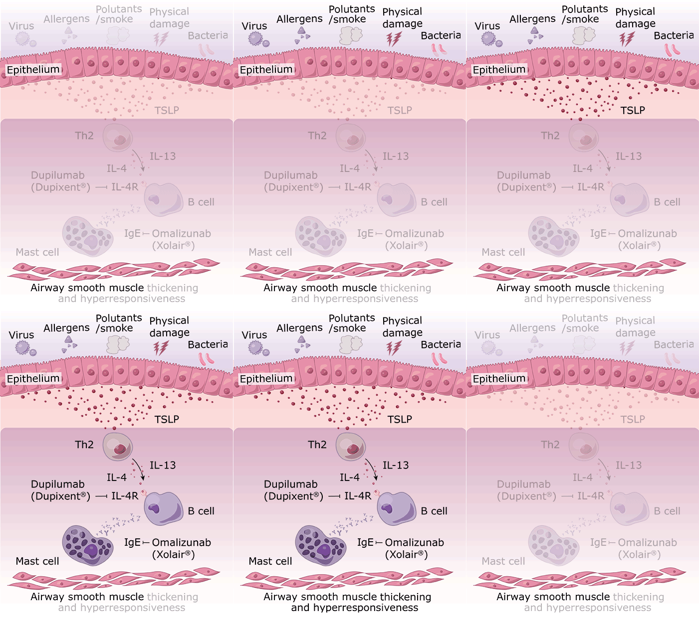
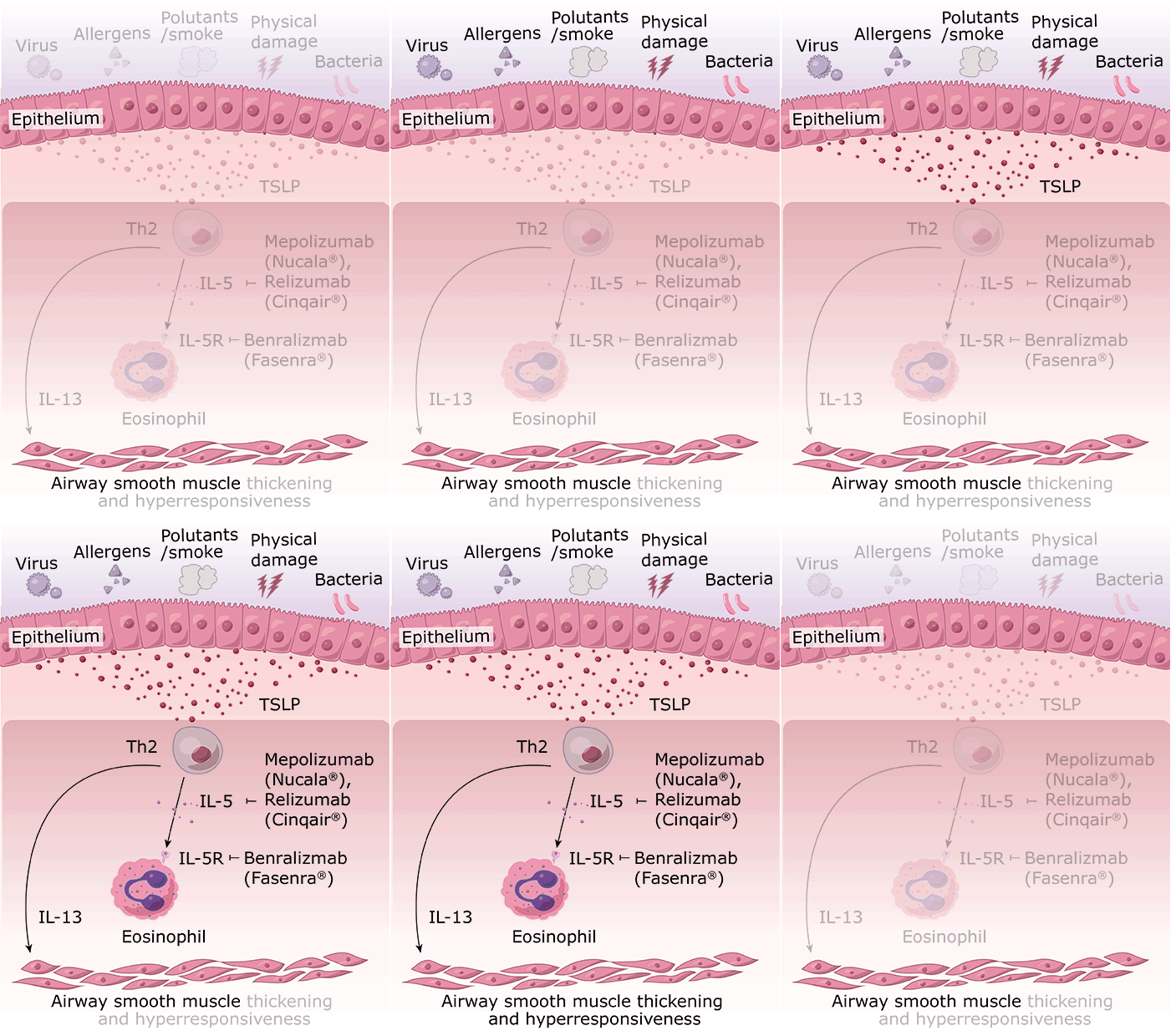
Inhalers are easy to use improperly, and developing delightful communication strategies while conveying accurate information is a difficult task. To reinforce the understanding of inhalers, we made a series of animations covering how to use various types of inhalers. The animation includes a guide on how caregivers can help their children use the inhaler properly.
’
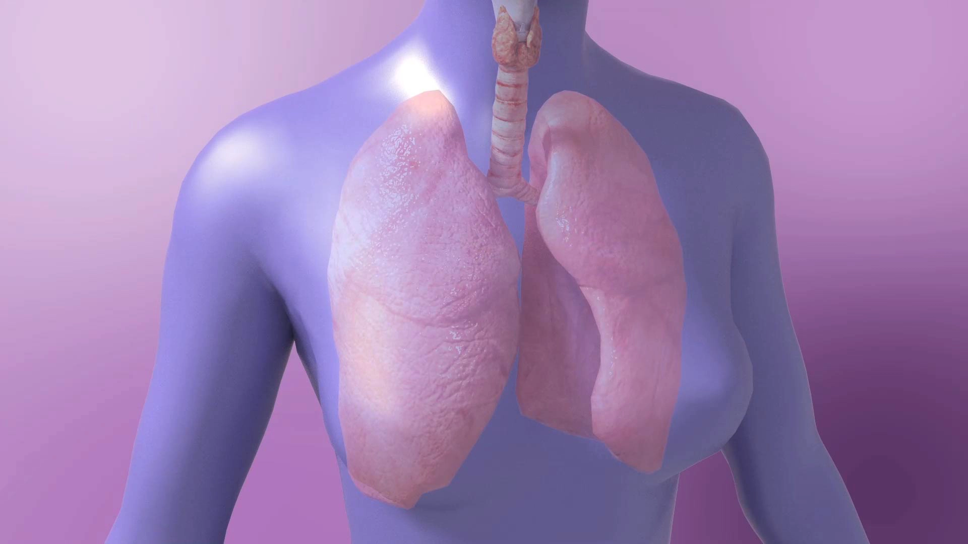
Until recently, it was believed that the cause and solution to all asthma is similar. A new concept however, states that it can also be caused by intrinsic factors such as other allergic diseases or abnormal increase in eosinophils in the bloodstream. Our 3D animation introduces this concept, opening clients up to a new possibility of testing and therapeutic options.
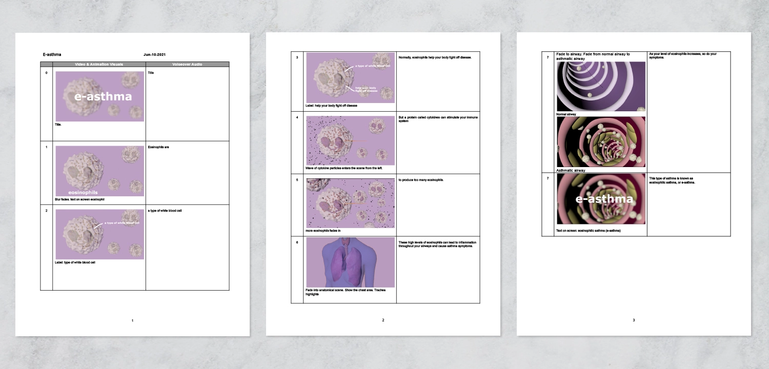



The website is spread to patients with severe asthma through pulmonologist nation-wide. The project reduced hospital visits, achieving better quality of life of those who suffered the most sever symptoms of asthma. The result, due to improvement of the patients' health, lead to better work quality of healthcare workers involved in asthma care.
We’re eager to hear about your next outreach campaign.
By understanding your goals and objectives, we can develop tailored strategic solutions to enhance your science’s impact.