Project Details
- Client :
Centers for Disease Control and Prevention - What We Did :
Infographic Design - Tools Used :
Illustrator - Completed on :
November 2019 - Skills :
Graphic Design / Illustration - Audience :
General Public
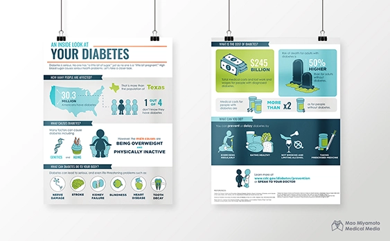
An Inside Look at Your Diabetes
This is a personal project where we redesigned the infographics about diabetes created by the Centers for Disease Control and Prevention. Visit here to view the original artwork.
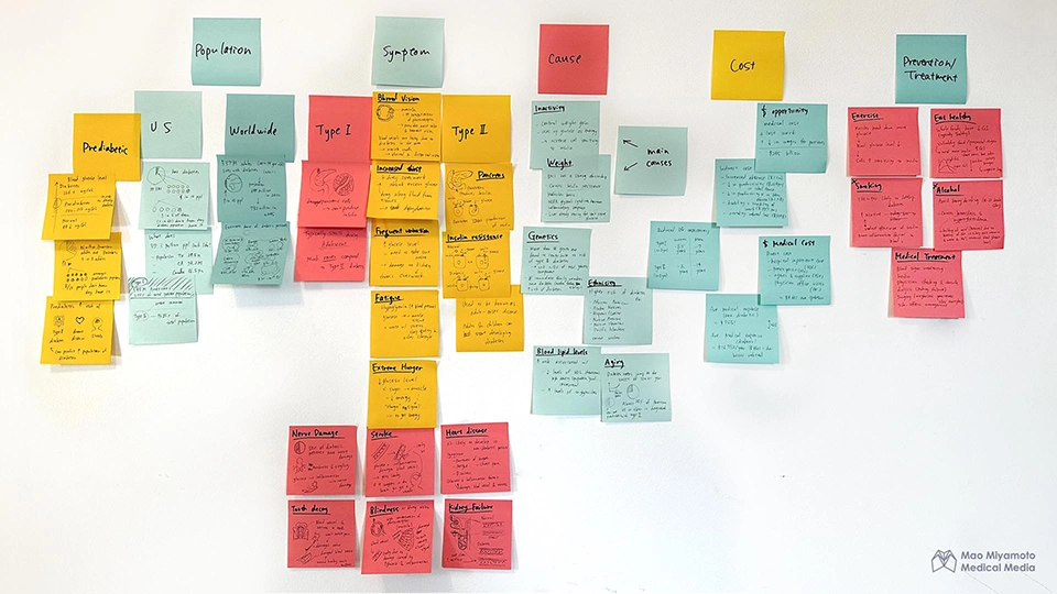
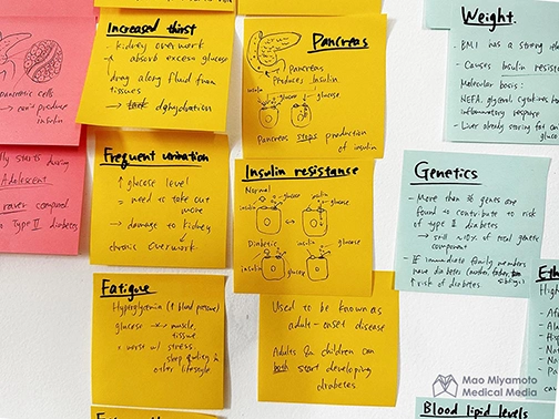
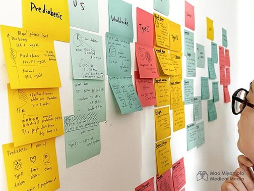
Step 1: Science Download
First, we started by the meat of the infographic: the content. We started by laying out everything that has a potential to make it to the infographics. We used post-its to put down detailed information on each topic. This approach not only enabled easy chunking and categorization of information, but also room to scribble sketches and brainstorm ideas on what visual representation can be used for the infographics.

Step 2: Sketches
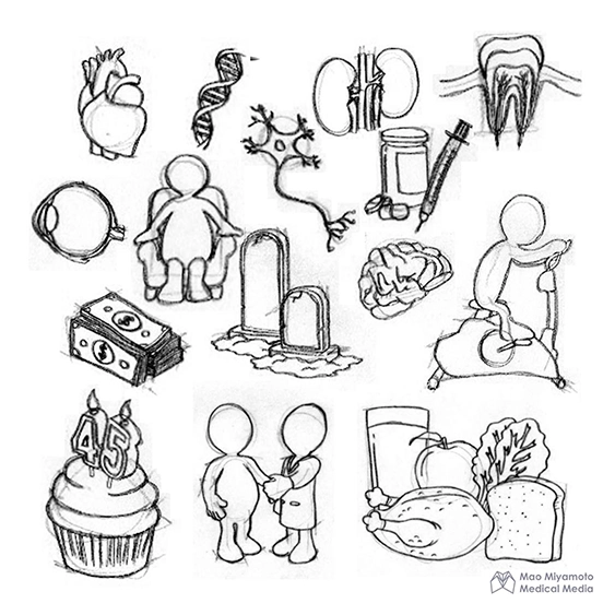
Once we laid out all the information, we started developing the sketches to explore ways to transform the information into something more engaging to look at.
Step 3: Design system
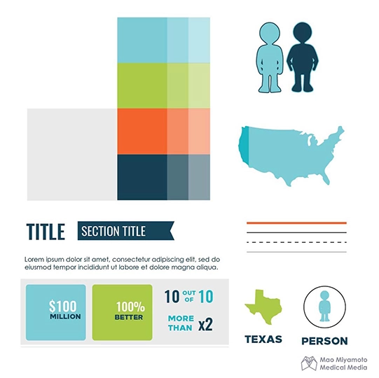
We built a design system to achieve a cohesive look throughout the infographic, no matter what kind of information we are discusing. Referencing other infographics, we made decisions on higher level elements such as color scheme, illustration style, and fonts. This serves as a blueprint to imagine the visual of the final product.
Step 4: Layout

We devided the content into sections and created multiple layouts of each. This approach gave us room to explore different layout easily and mix and match them with other sections without too much rigid structure. Here, we highlighted the layouts we explored for the "causes" section.
Step 5: Asset building
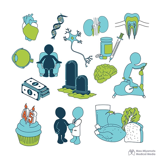
After locking onto the style and the color, we brought the sketches into a colored asset with clean lines and representation. Here, we compared the images that made it to the asset stage and how the before-after representation evolved.
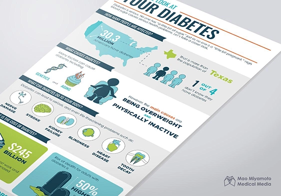
Step 6: Final artwork
Overall, our goal was to create a fun, friendly, and engaging look that encourages patients and general public to feel safe about learn something new about diabetes, rather than making it look daunting. We achieved this using vibrant color and unique visual elements that strikes a perfect balance between educational and enjoyable.